Color Palette
Temperature & Saturation
Decides whether to make the 'air' of the image cold or hot.
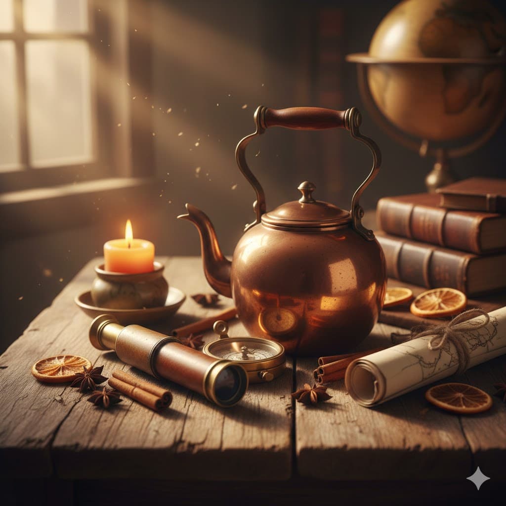
Warm tone, orange/yellow/red range, warm, cozy, and lively feeling
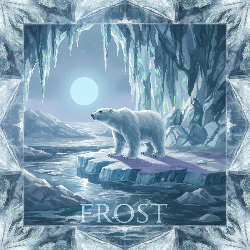
Cool tone, blue/purple/teal range, cold, rational, and either lonely or mysterious feeling
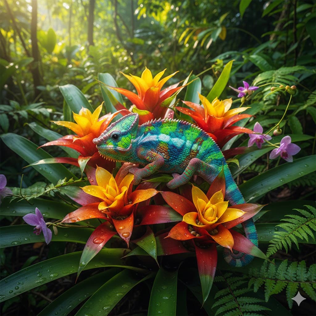
Vivid, highly saturated and punchy primary colors, full of energy and eye-catching
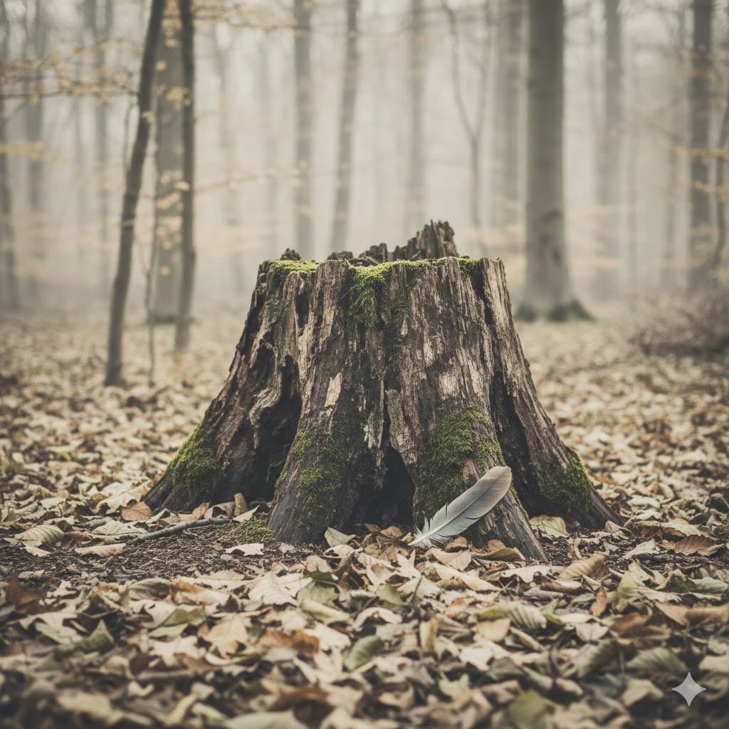
Mute/low saturation, calm and dull colors mixed with gray, giving a serious and realistic mood
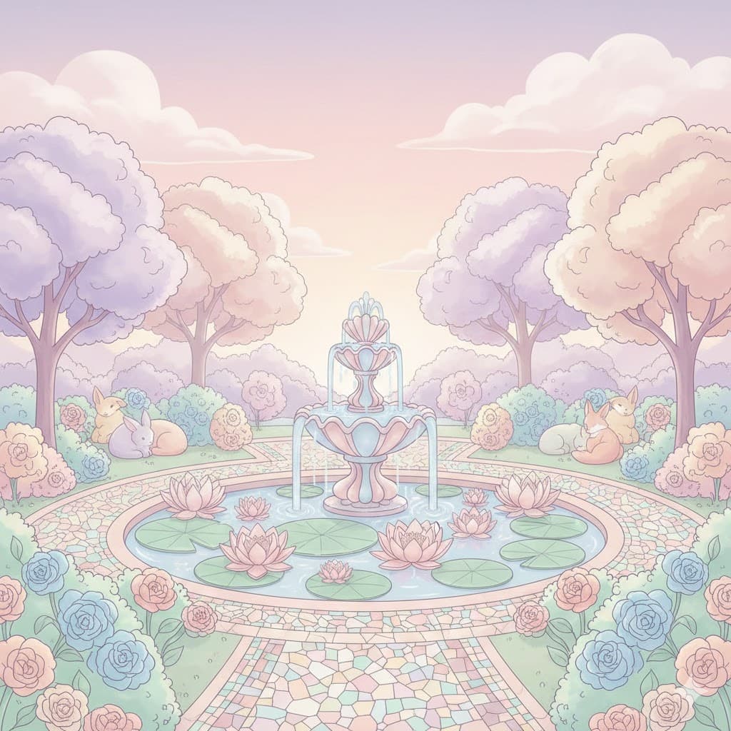
Pastel tone, soft and dreamy colors with a lot of white mixed in, evoking spring or a fairy-tale-like feeling
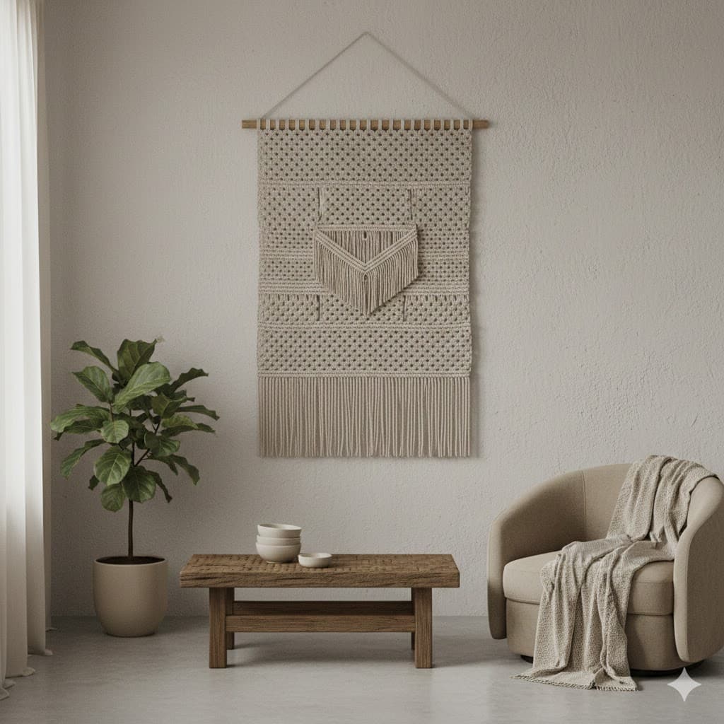
Neutral colors, beige, ivory, gray, etc., non-stimulating and comfortable colors
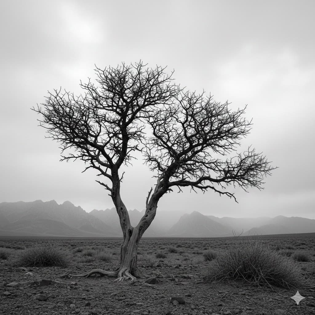
Monotone, black and white or a single hue
Nature & Material Based Palette
Borrow the unique color feel that a specific subject gives.
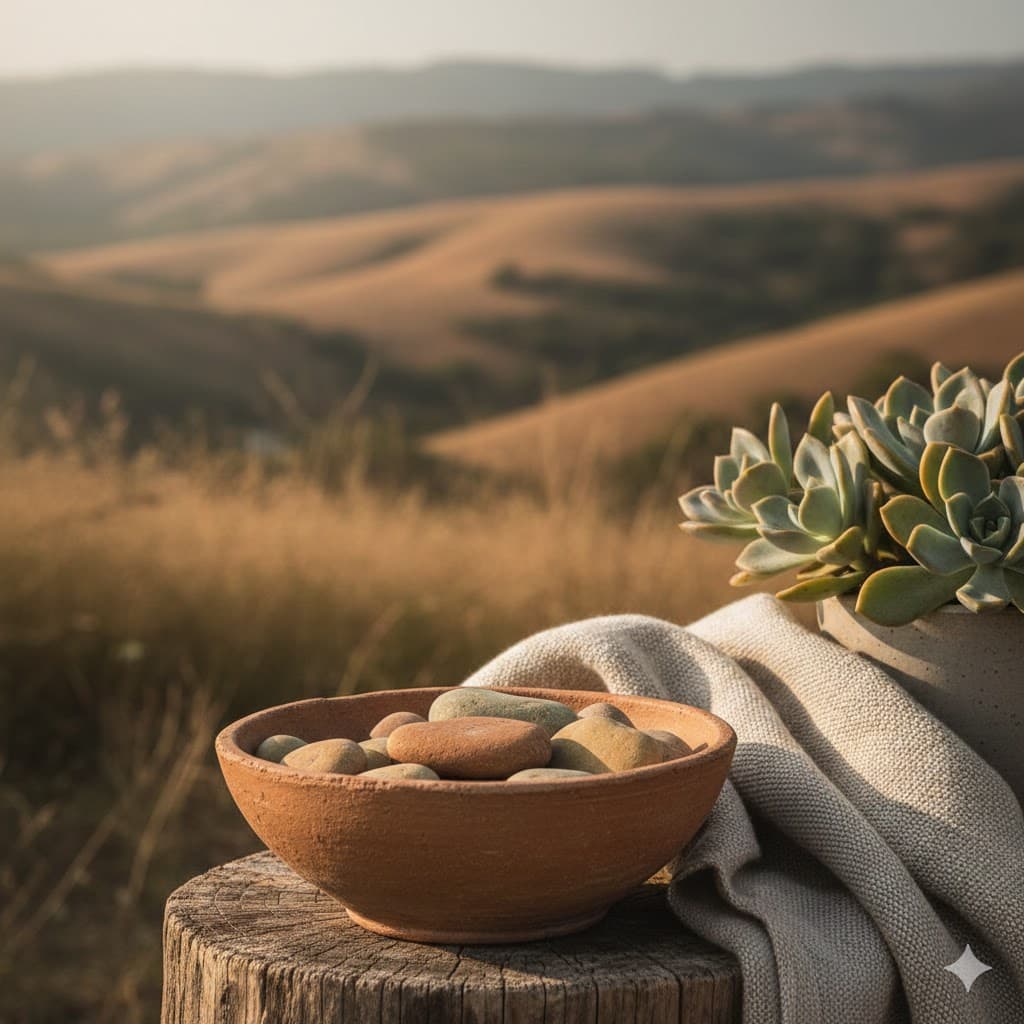
Earth tone, brown/khaki/olive green range from soil, wood, and forest, eco-friendly and vintage
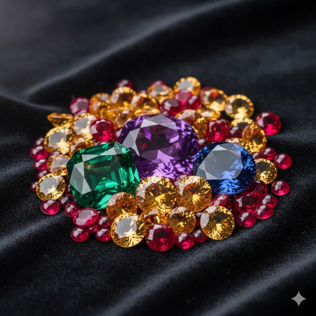
Jewel tone, luxurious deep and rich colors like emerald green, ruby red, sapphire blue, etc.

Metallic, glossy metallic colors such as gold, silver, bronze, chrome, etc.
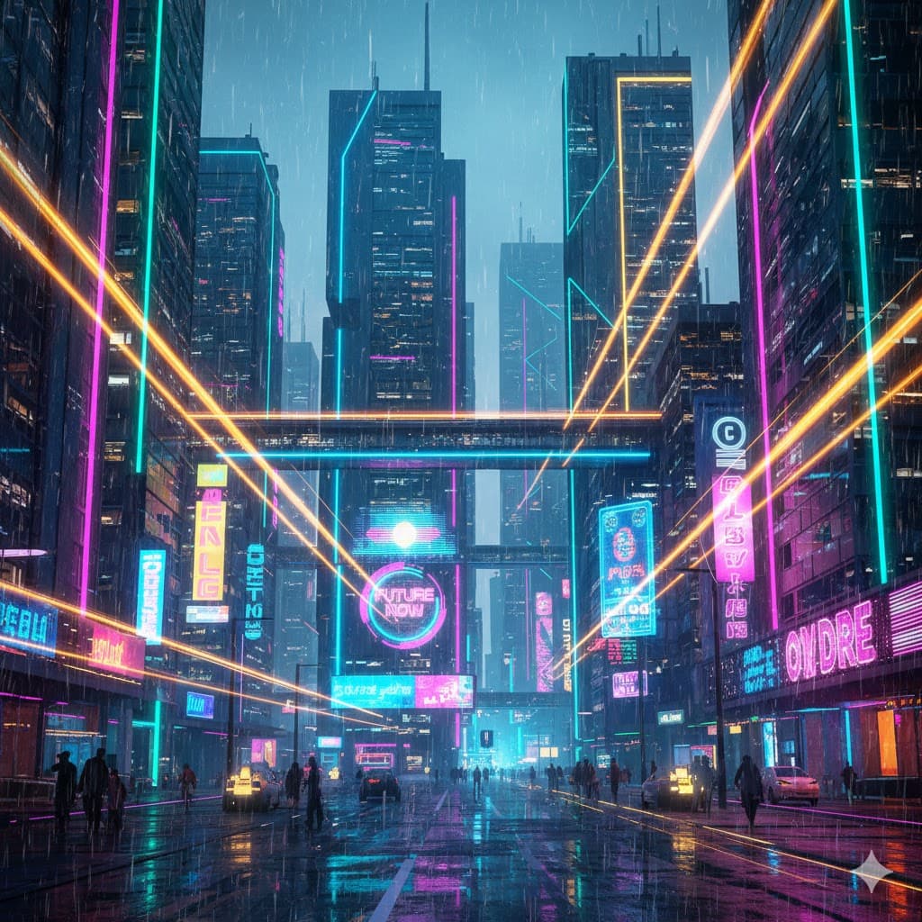
Neon/fluorescent, artificial and intense colors that look as if they emit light by themselves like glow sticks
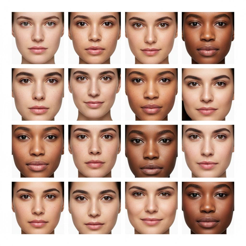
Skin tone, combinations of peach, brown, and beige centered on human skin
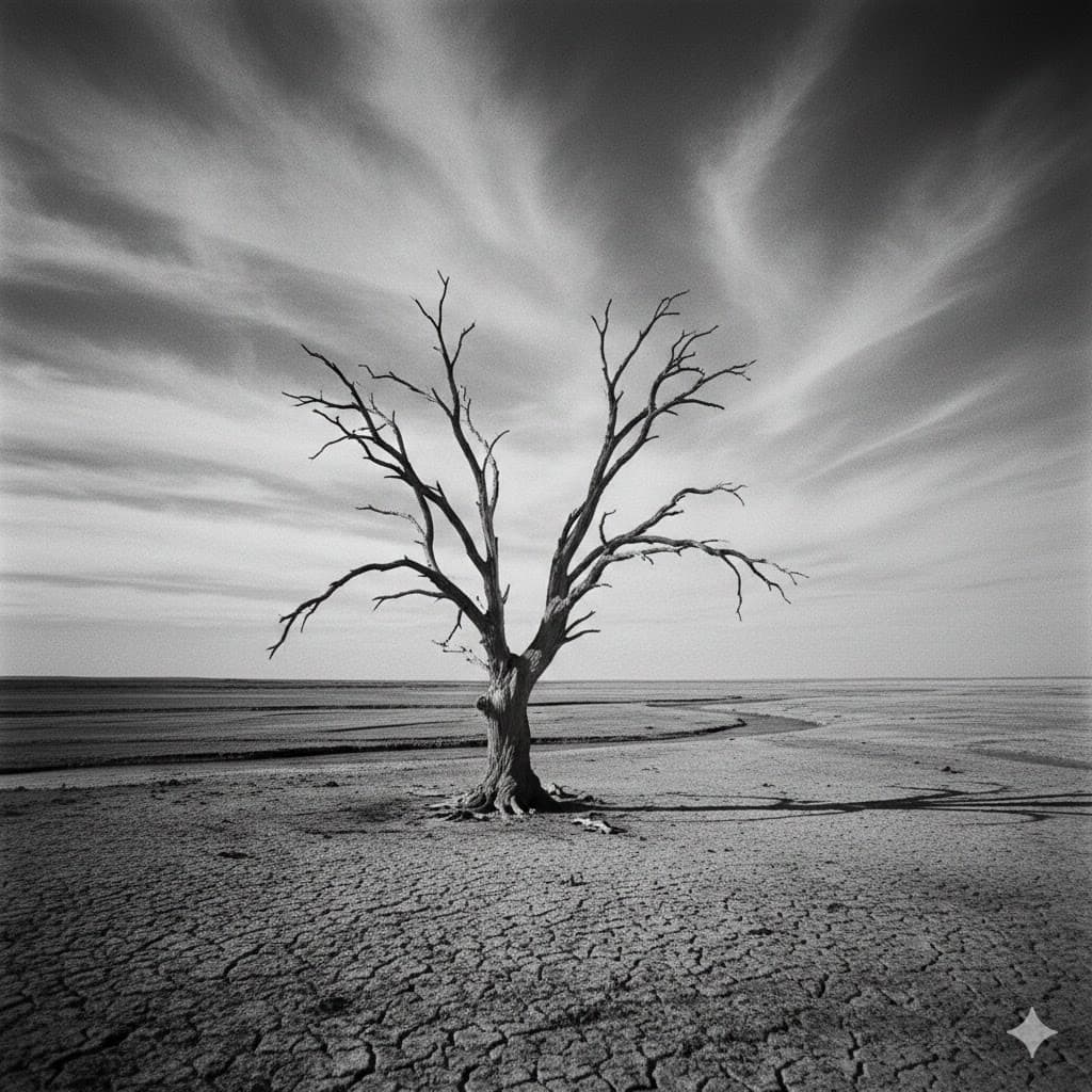
Black and white, excluding color to make you focus only on light and shadow