Color Scheme & Grading
Color Theory
These are mathematical color scheme rules used by designers.

Monochrome / tone-on-tone, varying only brightness and saturation within a single hue, giving a unified and sophisticated feel

Complementary contrast, placing opposing colors like red–green / blue–orange, emphasizing each other for an intense and dynamic effect

Analogous colors, hues that sit next to each other on the color wheel like blue–navy–purple, creating a natural and comfortable harmony

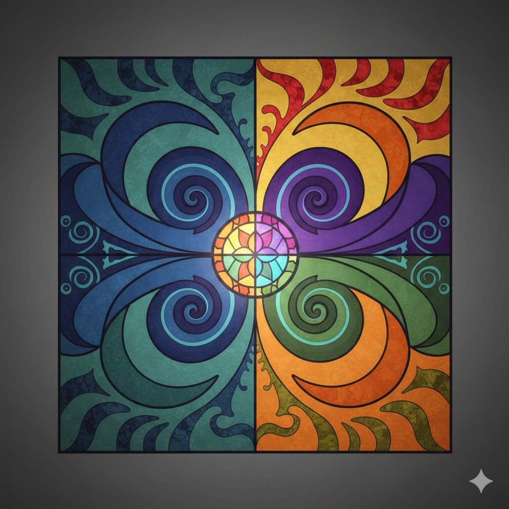
Triadic scheme, colors positioned at the vertices of an equilateral triangle on the color wheel, like red–yellow–blue, giving a vibrant yet balanced feel

Split complementary, using the two colors adjacent to a complementary color, less harsh than pure complementary yet more varied
2-color / 3-color combinations, limiting the image strictly to only 2 or 3 colors to create a graphic, design-like impression
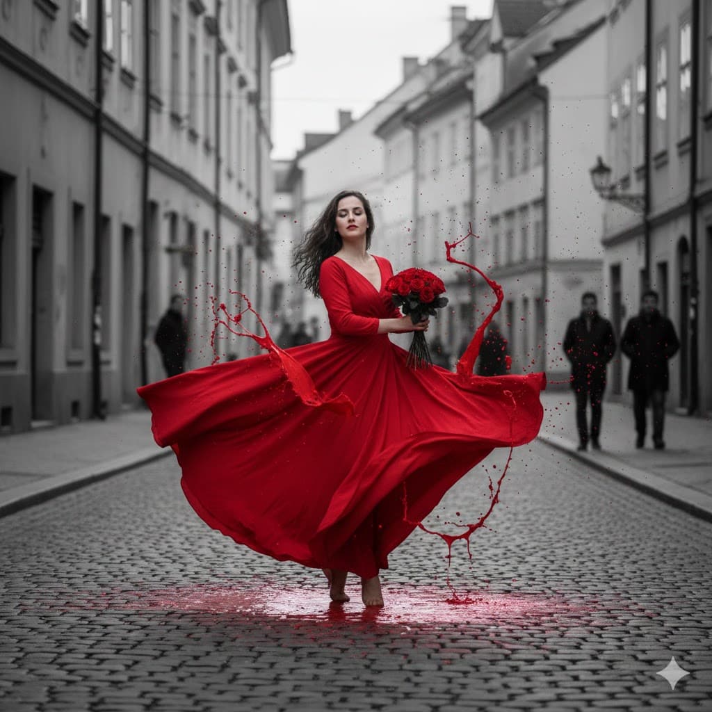
Color splash, the overall image is black and white but only a specific subject (e.g., lips, a rose) is painted red
Cinematic Grading
Signature color schemes favored by certain film genres or directors.

Teal and orange, the de facto standard palette of Hollywood blockbusters, making skin tones (orange) pop while cooling down the background (teal) to emphasize the subject
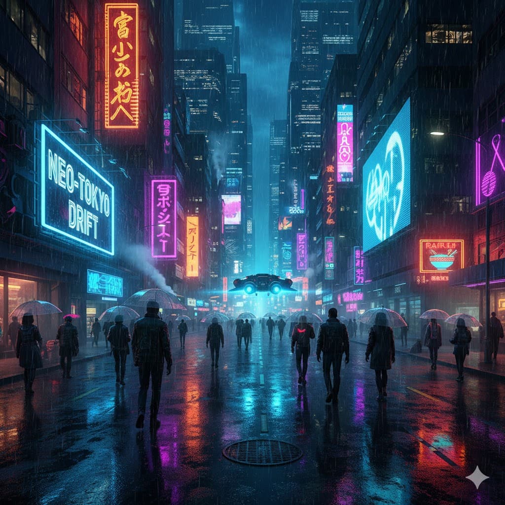
Cyberpunk, a combination of neon pink, neon blue, purple, and black
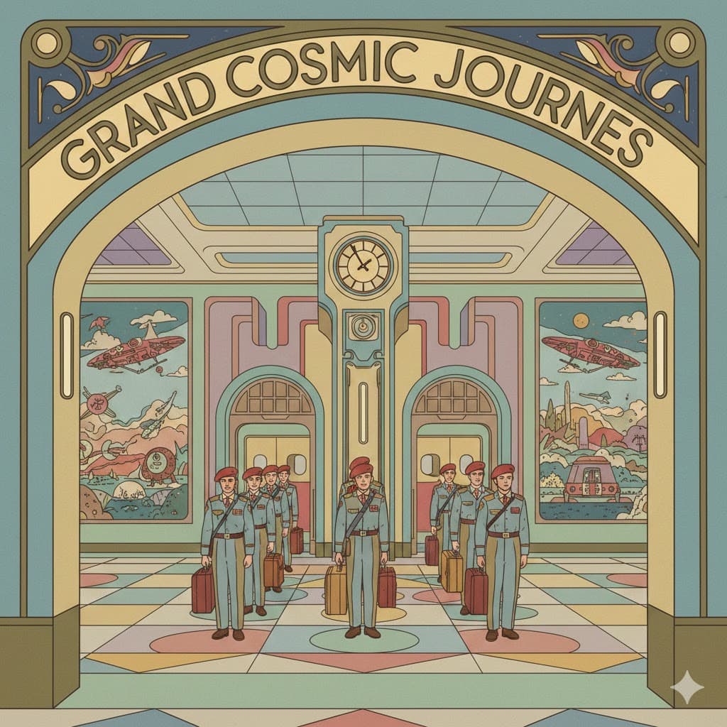
Wes Anderson, a fairy-tale-like vintage palette with high saturation, symmetry, and a mix of pastel tones and primary colors
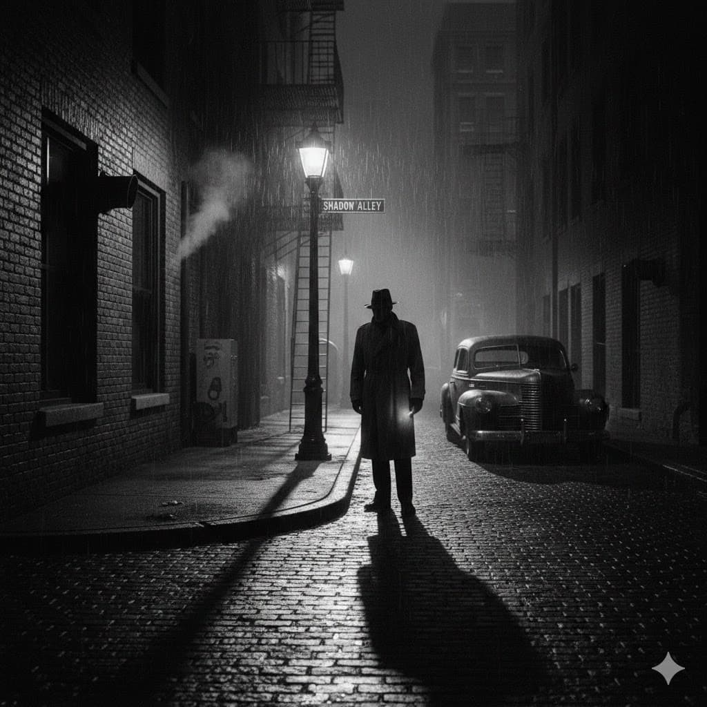
Noir, black-and-white or very low-saturation, dark style with strong contrast between light and shadow

Sepia, a faded brown tone, evoking old photographs or Western films
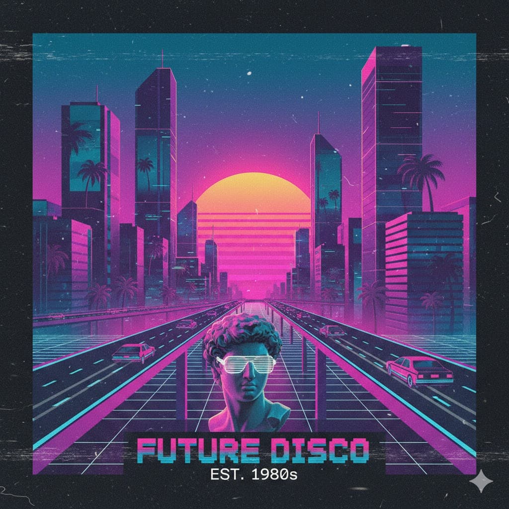
Vaporwave, 80s retro-style gradients of pink, purple, and mint

Technicolor, colors that are exaggeratedly vivid and multicolored, like in classic 1950s films